What a beautiful picture ...Photoshop did it?
(ENGLISH TEXT BELOW)
Che bella foto, chissà che interventi hai fatto in Photoshop? Volente o nolente qualsiasi fotografo si trova oggi a confrontarsi con domande del genere. Basti pensare alla foto vincitrice del World Press Photo Award 2013, la bella fotografia di Paul Hansen che tante reazioni ha suscitato, come è giusto che sia, la gran parte però rivolte al fotoritocco, secondo molti eccessivo, e ancora una volta tutti a scagliarsi contro il fotografo, reo secondo molti di aver calcato la mano per spettacolizzare una sua foto solo attraverso un uso quasi pittorico della luce e del colore, sicuramente ottenuto in maniera fasulla in postproduzione, secondo i molti detrattori.

Questa la foto incriminata, che molti ormai conoscono (ché tutto sommato lo scalpore equivale a pubblicità).
Alleggeriamo il tutto e parliamo di un contesto personale. Mi arrivano spesso domande da parte degli allievi circa la postproduzione dei miei scatti. Registro sempre tra chi inizia la sua avventura fotografica una convinzione che il passaggio in Photoshop sia ciò che dona a una foto la sua atmosfera e la sua intensità. A malincuore arrivano più domande in tal senso che non sulla visione del fotografo, o su ciò che lo ha portato a scegliere una determinata prospettiva, a mettere in risalto determinati elementi, o più semplicemente l’ora del giorno, la luce, ecc.
La postproduzione è un passaggio obbligato, si sa, ma appare agli occhi dei più la scorciatoia, quasi il “trucco di magia” con cui anche un fotografo mediocre può creare quasi dal nulla immagini spettacolari. Che ciò avvenga è risaputo, ma le foto mediocri appaiono spettacolari solo a chi non s’intende di fotografia , anche se ne consuma molta, il che oggi significa una moltitudine di persone. Anche in ambito di fotogiornalismo, si sa, la spinosa questione del fotoritocco fa passare notti insonni alle giurie più prestigiose. Tuttavia ritengo che chi, come nell’esempio della foto di Hansen, spara bordate contro la scelta di postproduzione sia decisamente ignorante di fotografia, oppure, ed è molto peggio, in malafede. Possiamo ragionare tutt’al più sulla necessità di “mettere a punto” (mi piace il termine inglese “tuning” che rende bene l’idea, lo utilizzerò in questo post), cioè proprio dare quel tocco finale a un’immagine tale che in qualche modo sia aiutata ad emergere dal brusio di fondo che la sottocultura delle immagini ormai produce. In qualche modo il fotografo “deve” esagerare. Mi chiedo se i fotografi non siano piuttosto vittime, tra l’altro sempre pronti ad aizzarsi l’uno contro l’altro.
Torniamo al ragionamento. Il fotoritocco come alternativa al saper fotografare, in un certo senso è questo che emerge. Non a caso nel fotogiornalismo, anche per tradizione, c’è un “filone” di pensiero che sostiene le immagini grezze, dure e dirette e non solo pochissimo elaborate, anche pochissimo “pensate”. Di contro fotografi che hanno fatto della loro firma stilistica particolarmente evidente, spesso ottenuta in camera oscura (tradizionale), un segno di distinzione. In un certo senso la replicabilità del processo digitale ha fatto perdere valore a questo aspetto. I “trucchi” di camera oscura erano tratti distintivi di un fotografo, oggi un plug-in di Photoshop o altri software possono replicare “esattamente” un processo di sviluppo digitale utilizzato da un determinato autore, facendogli così perdere unicità. Chi non ha sentito parlare dell’effetto “Dave Hill” o dell’effetto “Dragan”? Basta cercare su youtube e i tutorial si sprecano.
Se una cosa è replicabile, si sa, non è più arte. Eppure ai posteri il “tocco” tipico delle immagini di questi anni apparirà come una “moda”. Personalmente vedo nella bella foto di Hansen il tipico “tuning” di questi anni, mi chiedo anche se non ne sia artefice qualcun altro, uno studio, un grafico di redazione. Anzi oggi che siamo tutti free-lance, più che di redazione, un grafico di qualche studio a pagamento. Desaturazione e tonalità seppiata, è il tuning attualmente più usato. A pensarci bene, questa foto (come altre) è praticamente monocromatica, è un bianco e nero che però non vuol esserlo, con una nota di colore che di per sé suscita delle emozioni (generalmente un viraggio o verso il marrone o verso il blu, tipicamente da bilanciamento del bianco o da filtro) ma senza la distrazione indotta dai colori (ad esempio il blu elettrico della tuta indossata dall’uomo a destra).
Possiamo gridare allo scandalo o alla mistificazione? Il colore della tuta è fondamentale per la comprensione della storia narrata dalla foto? Ci muoviamo allora in un ambito dove le scelte non sono più dettate dal “giusto o sbagliato” ma anche e soprattutto dalle intenzioni dell’autore, nella migliore delle ipotesi, o più probabilmente di una redazione. Sono convinto che molti miei colleghi oggi si uniformino a un certo gusto per due ragioni di fondo: moda e opportunità. Non me la sento di dargli torto. Moda perché il gusto corrente predilige e quindi richiede immagini con questo tipo di tuning. Opportunità perché se non ti adegui è possibile che le tue foto siano penalizzate rispetto ad altre, e la concorrenza oggi si sa è spietata (siamo tutti free-lance), perché l’art director di turno (sempre che ce ne sia uno nelle redazioni) a sua volta è condizionato dal gusto corrente. A meno che tu non sia un mostro sacro della fotografia che fa scelte totalmente autonome, uniformarsi alla moda è necessario.
Forse, in conclusione, se il fotoritocco in un certo senso si standardizza, la cosa non è poi così da temere. Magari in questo modo sono le foto a parlare più che il tuning. Tutte le foto dal Medioriente in scenari bellici sono desaturate, virate verso il marrone e con dosi diverse di contrasto….bene. Non è come se in un certo senso scattassimo nuovamente tutti in bianco e nero? Forse che in bianco e nero le foto erano/sono tutte uguali?

Foto che ha suscitato curiosità negli allievi per la postproduzione che si supponeva molto elaborata
Personalmente, negli anni sto tornando sempre più verso il bianco e nero, vero e proprio. Il colore mi disturba, talvolta è protagonista di un’immagine, come nelle fotografie di Steve McCurry che ormai conoscono tutti, ma il più delle volte distrae. Sta al fotografo non introdurre colori invadenti nelle sue foto, ma oggettivamente, pensando alla foto di Hansen, avrebbe dovuto chiedere alle persone in lutto di indossare abiti meno colorati? Una riflessione sul colore non può certo ridursi a queste poche righe. Mi sento di aggiungere che ormai note di colore forti e nette sono un espediente per catturare l’attenzione di un gusto più di massa. Così facendo tuttavia si “distrae” l’osservatore e non lo si induce a percepire un’immagine nella sua essenza, di forma, spazio, luce.
Allego qualche esempio fotografico di due recenti reportage in cui ho scelto il bianco e nero, mostrando l’equivalente a colori (d’altronde sempre possibile in digitale). Una è la foto “incriminata”, il che mi permette di tornare alla riflessione iniziale. Perché il rischio è questo, che se una foto appare ricca di intensità anche grafica, è opinione corrente che sicuramente la postproduzione l’ha resa tale. In un certo senso si rischia oggi che un bravo fotografo che ha scelto finemente momento, composizione, luce, ecc. sia ritenuto tutt’al più un bravo “fotoritoccatore”. Personalmente e per lavoro io devo dialogare anche con chi è inesperto di fotografia (e mi piace farlo) e devo tener conto di ciò che una foto suscita. Una forte dose di contrasto, che si sa regge bene solo su foto che sono perfette dal punto di vista di luce ed esposizione, può apparire come un fotoritocco elaborato e complicato, tale da far pensare: “bella…che cosa hai fatto in photoshop?”. Una sensazione che sarebbe bene non suscitare.
Come molti fotografi, condivido qualche foto su facebook per mantenere il contatto con il pubblico. La foto (poco sopra) è quella che ha fatto pensare a un fotoritocco spinto. Ne abbiamo quindi discusso a lezione e questa riflessione ne è scaturita.
Potrà sembrare incredibile ma questa foto dentro photoshop non è nemmeno passata. Il lavoro c’è, tutto sul RAW, ma quel che è stato aggiustato finemente è il dosaggio di luminosità e di contrasti, niente è stato introdotto o alterato. La foto a colori da cui “partiva” (nel RAW i dati sul colore sono sempre presenti anche se abbiamo utilizzato un effetto monocromo nella fotocamera) è questa, un’immagine a colori sì ma, per meglio dire, l’immagine come era prima dell’ultimo intervento di passaggio al bianco e nero.

La fotografia a colori lascia intravedere meglio come gli interventi correttivi siano avvenuti esclusivamente per un’ottimizzazione della luce, dove ricerco una curva tipicamente non digitale, con maggiore contrasto sui mezzitoni e compressione delle alteluci. Il digitale richiede una ottimizzazione di questo tipo perché registra la gamma tonale in maniera lineare, a differenza delle pellicole che hanno ciascuna una sua curva caratteristica.
Il colore qui è importante per trasmetterci l’atmosfera, la luce calda sul metallo, trattandosi di foto fatte all’alba, il contrasto cromatico tra questa e il blu dello sfondo o delle tute degli operai. Tutto questo non si perde interamente nel viraggio al bianco e nero, perché i contrasti cromatici si trasformano in contrasti di luce. Uno scatto di partenza con passaggi tonali puliti rende immagini in bianco e nero altrettanto nette. Direi che anzi il bianco e nero rende visibili maggiormente i contrasti di luce altrimenti camuffati dal colore (rivedere la foto in B&N).
Un altro esempio di scelta del bianco e nero laddove il colore non solo non era di particolare disturbo ma anzi contribuiva a rendere un’atmosfera unica, è questa serie:

La gallery completa, visibile in home, è interamente in bianco e nero e così queste foto verranno pubblicate sul cartaceo e in mostra. E’ ancora possibile che una redazione, interessata alle foto, ti chieda però di mandare loro anche la versione a colori. Il discorso sull’opportunità e sul gusto corrente, di cui sopra, è all’ordine del giorno per il fotogiornalista.
Anche questa foto a seguire, a colori, mantiene una sua armonia, malgrado io abbia scelto nella versione a colori di attenuare molto la saturazione per non distrarre l’osservatore con i colori, bellissimi, delle vesti indossate dalle donne indiane anche quando svolgono lavori pesanti. Di questa foto amo l’istantanea, la composizione, il gesto, la relazione tra i personaggi. E’ indubbio che in bianco e nero tutto questo emerga più nettamente e “obblighi” anche l’osservatore più disattento a concentrarsi su elementi diversi dal colore, seguendo maggiormente la visione del fotografo e gli elementi che questi intende porre in evidenza. La postproduzione non deve apparire.

Spero che da questa trattazione evidentemente parziale e solo abbozzata nasca una riflessione ulteriore, non ho la pretesa di possedere la verità su un argomento così controverso ma spero di aver fatto un po’ di luce partendo dalla mia personale esperienza di fotografo alle prese continuamente con dubbi amletici circa la post-produzione.
Può tornare utile leggere anche questi articoli che ho scritto sul medesimo argomento, partendo da spunti differenti.
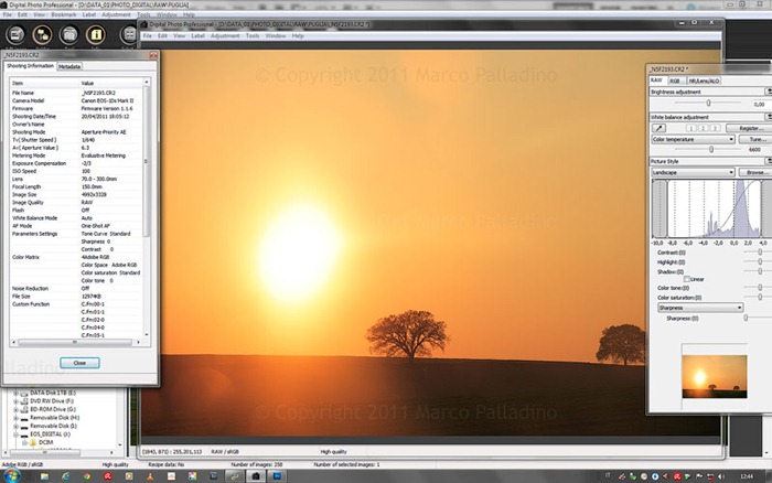
FOTORITOCCO E POSTPRODUZIONE: DOVE E' IL LIMITE?

LA CURVA DI CONTRASTO CARATTERISTICA: PELLICOLA E DIGITALE

Tutti i post sul tema FOTORITOCCO >>>
Buona discussione…
©2013 Marco Palladino – Tutti i diritti riservati
--------------------------------------------------------------------------------------------------------------
What a beautiful picture ...Photoshop did it? Post-production and photo retouching
What a beautiful picture, who knows what treatments you have made in Photoshop? Willy-nilly any photographer is today confronted with such questions. Just think about the winner photo of the World Press Photo Award 2013, the beautiful photograph of Paul Hansen, that has aroused so many reactions, as it should be, the vast majority however addressed to the editing, that many have considered excessive, and once again all complaints against the photographer, who is guilty according to many of creating drama in picture out of retouching, with an almost painterly use of light and color, definitely got in a fake way, according to many critics.
There are those who came to the hypothesis that the light on the faces, coming in from the left, has been recreated artificially by the photographer during post-production, “it would be impossible" to have a similar light. Without even need to remember that the light bounces and nothing unreal appears in this photo, I wonder why there is so much attention to the editing and so little to what the photograph communicates and tells, specially in the case of picture journalism. Almost that that "stage," what has became the Palestine now, is part of a never-ending story, in the collective mind, that the Israeli-Palestinian conflict has become now an immutable fact: "Hey look at another picture on murder victims in Palestine ... well, let’s see what retouching he used the photographer ..."
Now from a lighter and personal context. I often get questions from students about the post-production of my shots. I collect always, among those who began their photographic adventure, a common belief that the passage in Photoshop is what gives a picture its atmosphere and its intensity. Reluctantly I get more requests on that than on the photographer's vision, or what led him to choose a particular perspective, to highlight certain elements, or simply bout the time of day, the chosen light, etc..
The post-production is a must, we know, but it appears in the eyes of most people as the shortcut, almost the "magic trick" by which even a mediocre photographer can create spectacular images from almost nothing. This happens sometimes, but mediocre photos appear spectacular only to those who do not understand photography, even if they consume a lot of it, which today means a multitude of people. Even in the field of photojournalism, you know, the never-ending troubling concerns about the photo editing keeps asleep the most prestigious boards. However, I believe that those who, as in the photo of Hansen, so quickly jumped against his choice of post-production if not ignorant of photography, they are not honest, which is much worse. We can speculate, at most, on the need to "fine-tune" (I like the English word "tuning" to express this idea, I'll use in this post), what is just to give that final touch to an image such that in somehow it be helped to emerge from the background noise of the nowadays subculture of the images. Somehow the photographer "has to" overdo it. I wonder if the photographers are not quite the victims, instead, and they are always ready to jump on each other.
Let's go back to the topic. Photo editing as an alternative to be able to photograph , this is the common sense. Not by chance in photojournalism, even by tradition, there is a "trend" towards producing raw harsh images, pictures that not only have been very little retouched, they have been very little "meditated". Conversely there are photographers who have made their signature a style, which is often obtained in the (traditional) darkroom. The fact that it can be replicated, when digital is the process, has made it lose value as expression. The "tricks" of the darkroom were hallmarks of a photographer, now a plug-in for Photoshop or other software can replicate "exactly" the digital development process used by a particular photographer, thus making him lose uniqueness. Who has not heard about the "Dave Hill" effect or "Dragan" effect? Just search on Youtube and tons of tutorials are there.
If one thing is replicable, you know, it is no longer an art. Yet the posterity will look at the typical "touch" given to images in these years as a "fashion". I see in the beautiful picture of Hansen the typical "tuning" of these years, I also wonder whether it is someone else's the creator, a studio maybe, a graphical editor. In fact today we all are free-lance, many of us rely on the post-production of some studio for a fee. Desaturation and sepia tones, it is the most currently used tuning. On second thought, this photo (among others) is almost a monochromatic one, it is a black and white that does not mean to be, with a hint of color which in itself arouses emotions (usually a color change either as brownish or as bluish, typically coming from the white balance or from a filter) but even so the avoid the distraction induced by the colors (for example, the electric blue of the suit, the man on the right).
Should we cry scandal and mystification? Are the colors of that shirt so essential for the understanding of the story from the picture? Thus we move into an area where the choices are no longer dictated by "right or wrong" but also by the intentions of the author, at best, or more likely by an editorial staff. I am convinced that many of my colleagues today fit to a certain taste for two basic reasons: fashion and opportunities. I do not dare to blame them. Fashion because this type of tuning is what current taste prefers and therefore requires. Opportunity because if you do not adapt, it is possible that your photos are penalized, others are preferred only because they are seen and yours are not, for the competition is fierce today we know (we're all free-lance): the art director (hopefully there is one in the newsroom) is affected by the current taste. Unless you're not a sacred monster of photography that makes his own choices, it is necessary to agree somehow with the current fashion.
Perhaps, in conclusion, if the editing got somehow standardized, it is not that bad. Maybe it is the photos to speak more than the tuning? Quite all photos from the Middle East war scenarios are desaturated, tuned to brownish and with only different doses of contrast .... well. It seems to me as we got back to black and white. Can you tell that black and white pictures were/are all similar?

This is the picture that started the discussion in the class.
Over the years I'm going back more and more to the black and white, true pure B&W. The color bothers me sometimes even they protagonist of an image, as in the photographs who have made the career of a Steve McCurry, I find it most of the times distracting. Of course it is essential the photographer not puts intrusive colors in his photos, but objectively, if you think about the photos of Hansen, had he to ask the people to wear less colorful clothes? A speculation about color can not be reduced to these few lines. I would add that now strong touches of saturated color are the gimmick to capture the attention and the common taste. In doing so, however, photographers "distract" the observer and do not induce to perceive their images in its essence, form, space, light. This is just my personal idea, of course.
These are some photographic examples of two recent reports in which I chose the black and white, I’ll show the equivalent in color (after all it is always possible in digital to return to color in a file.) One of these is the photo "incriminated" by the students, what allows me to return to the initial topic. Because the risk today is this, that if a photo looks full of intensity, it is believed that the post-production definitely has made it such. In a sense, it is likely today that if a photographer has finely chosen moment, composition, light, etc.. he is considered at best a good "post-producer."
For my work, I have to talk with and understan those who are total noob in photography (and I like it) and I have to take into account what impressions a photo arouses inside uneducated minds. A strong contrast, for instance, which is possible only on photos that are perfect for light and exposure (unless you “burn” it to its extremes), may look like an elaborate and complicated photo editing, such as to suggest the initial question: "what a beautiful image... what have you done in photoshop? ". A feeling that it would be better not to arouse.
Like many photographers, I share some photos on facebook to keep in touch with the public. The photo (just above) is the one that made students think about strong photo editing pushes. We then discussed it in the class and this post got out. It may seem unbelievable but this photo has not even past through photoshop. Ther’s work there of course, everything on RAW, but what has been finely adjusted is the dosage of brightness and contrast, nothing has been introduced or altered. The color photograph from which it “originates” (in the RAW file, color data are always present even if we used a monochrome effect in camera) is this one, yet a color image, but rather the image as it was before the last conversion to black and white.

Color photography shows us better what corrective actions have taken place for optimization of light, where I often seek for a typically non-digital curve, highly contrasted midtones and compression of the highlights. Digital images always require an optimization of this kind because this technology records the tonal range in a linear way, unlike the films each of which has its characteristic curve.
The color here is an important part of the picture and settles the atmosphere, warm lights on the metal (these are photos taken at dawn), the color contrast between these structures and the blue of the background or of the workers. All this is not entirely lost in the black and white, because color contrasts are to be transformed into light contrasts. One shot starting with good tonal passages makes equally clean images even in black and white. I would say that the black and white makes it more visible to us the contrast of lights, which are otherwise camouflaged by the color (review the pictures in B&W).
The following is another example of black and white coming out from a picture where color was not bad and rather contributed to set a unique atmosphere, this series:

The full gallery is visible in the home, it is entirely in black and white and so these photos will be published on paper and on exhibitions. It 's still possible that an editorial board that is interested in the photos, however, asks you to send them the color version. The question on the advisability of current taste, as said above, is in the agenda of the photojournalist.
Another picture to follow, here color maintains its meanings, despite I have chosen in the color version a strong mitigation of it by less saturation, in order not to distract the viewer. The clothes worn by Indian women even when performing heavy work are gorgeous, indeed, but not necessary to the picture. I love this photo for the snapshot, the composition, the gesture, the relationship between the two characters. And I don’t doubt that by black and white all this will emerge more clearly and "pushes" even the most careless observer to focus on factors others than color, to follow more precisely the photographer’s vision through the elements that he has chosen to highlight. And the post-production should not appear.

I hope that with this very subjective and partial discussion is born some further discussion, I do not claim to possess the truth about such a controversial topic, but I hope I have done my part, according to my own experience as a photographer who is constantly struggling with doubts about the post-production, to set a bit of light on the topic.
It can also be useful to read these articles I have written on the same subject, starting from different points (They are in Italian sorry, I’ll translate them as soon as possible).
And please leave a comment…
FOTORITOCCO E POSTPRODUZIONE: DOVE E' IL LIMITE?
LA CURVA DI CONTRASTO CARATTERISTICA: PELLICOLA E DIGITALE
Search label POST-PRODUCTION >>>
©2013 Marco Palladino – All rights reserved


